Windows 11 - The Good and The Bad (there is no ugly)
Towards to end of last year I decided to go for it and install Windows 11. Now keeping in mind that I was installing it on my only computer, and only a couple of days before I ran a workshop, it probably wasn’t the best idea (everyone knows you don’t install updates before workshops, let along an entire new operating system), but thankfully everything worked out fine. Coming up on about 5 months now, it’s grown on me, and although there’s a few things that could get an improvement, you can see the thought that’s gone into this latest Windows version.
The Good
There’s a lot of things that have definitely been thought of for this latest version, and it’s nice to see where things have clearly been prioritised.
Sounds
Now sounds may not necessarily be the first thing most people notice, but when I’m doing dev work, I encounter the Windows admin prompt many times a day. And that sound has always been quite abrupt, I get where that decision has come from as it is warning you that you’re about to do something potentially dangerous. But for those of us who are well and truly familiar with what we’re doing, and just want to get on with work, this is a sound that gets to you, and can start to be grating as it suggests there’s something wrong.
So when I noticed that the sounds in Windows 11 had changed, it was a pleasant surprise. Whilst still clearly resembling the sound we’re used to, they’re softer and more thoughtful, so the admin prompt still notifies me, without feeling quite so abrupt. Again this is a relatively simple change, but one that definitely makes my experience better.
Icons and Design
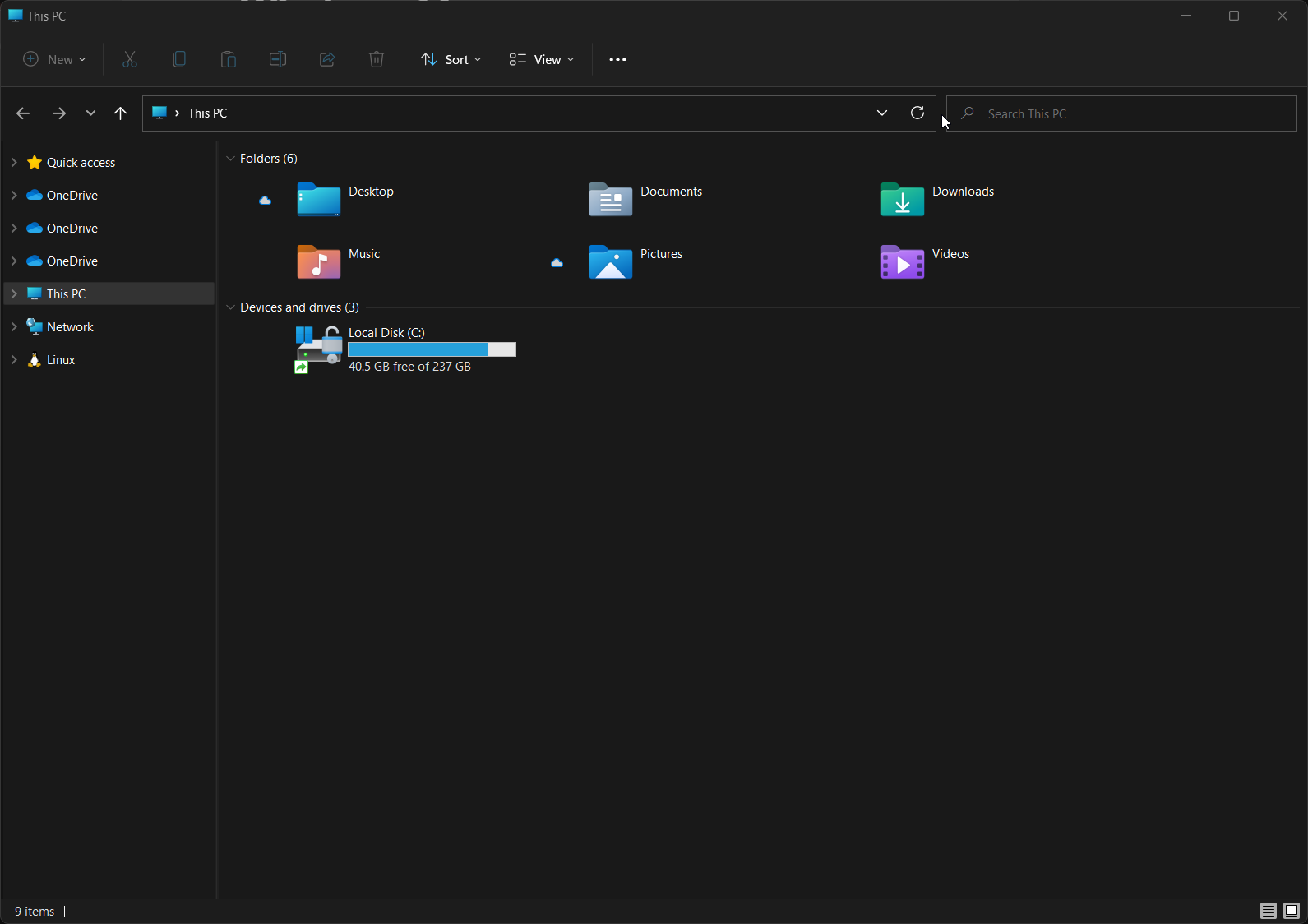
Probably the more obvious change is the design changes, and updates to the existing Windows iconography. Design is not my forte, and I’m always impressed when I see the little things that designers come up with. And so to see the new, more modern looking Windows icons makes me smile a little.

Focus Timer
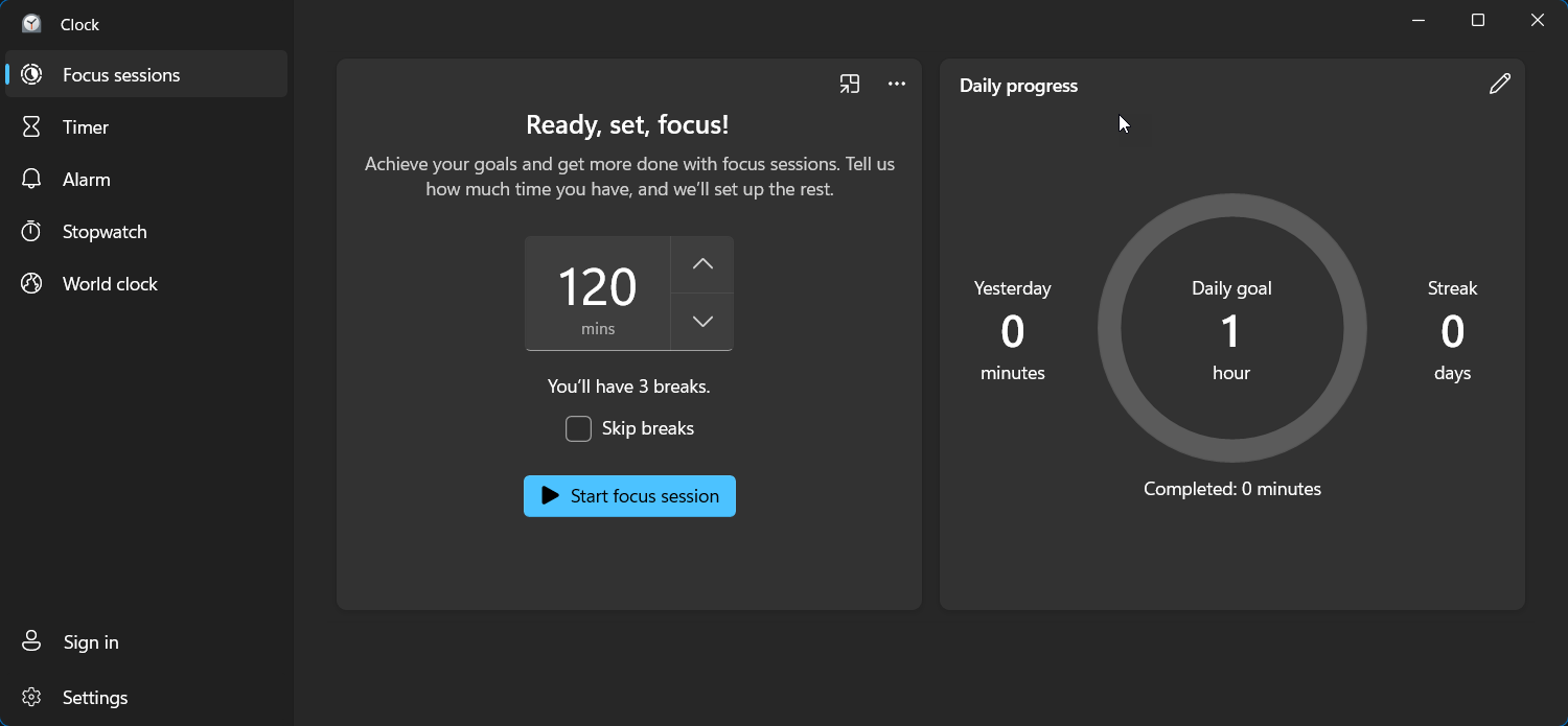
I’ve been experimenting on and off with the Pomodoro method, but really struggling when it comes to finding an app that works for me. Having an app on my phone means I miss the notification if my headphones are on, and the apps on Windows don’t have the best experiences (Mac seems to get much more love in this department). So imagine my surprise when Googling for another option to try and discovering that Windows 11 had this built in? The built in clock app now includes a focus timer, and integrates with Spotify if you have that installed, or Microsoft Tasks if that’s your todo list of choice.

The thing I like about this as well is that you can tell us how much time you have to focus (eg. 2 hours), set your preferred break length (I go with 5min) and it’ll split the time blocks up as needed, filling the slots with time blocks that are not too long, but give you enough time to get into things.
The Bad
As I said, it’s not all good, there’s definitely quite a few quirks that could use some more work (or significant reworks.
Start Menu
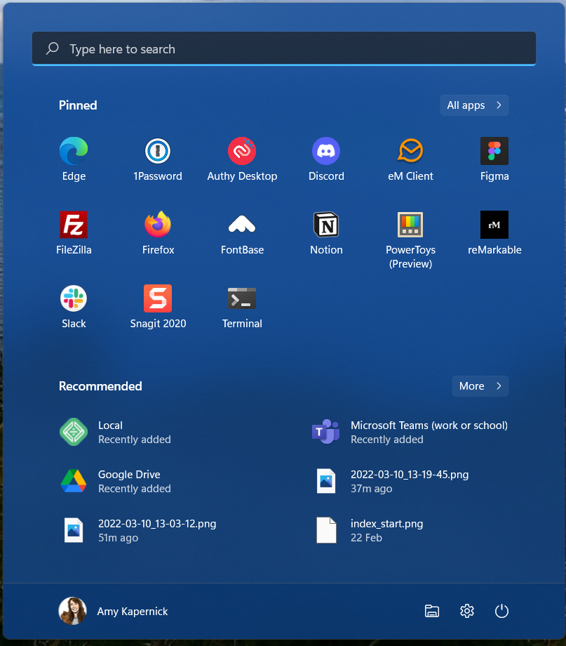
Now while I wasn’t a huge fan of the new start menu back in Windows 8, it’s grown on me. So when they changed it to a fixed size and stole half the room for “Recommended” items, (which still stays there even if you turn the recommendations off, I checked), that’s definitely something I’m not a fan of. Without being able to actually utilise the whole space, means you’re limited to only 18 pinned apps at a glance.

Thankfully I’ve gotten my head around Microsoft PowerToys, so most of my accessing apps is done via the keyboard now, but the is definitely something that needs to be fixed.
All in all, it’s been a fairly decent experience and I’m glad that I gave it a shot. Windows 11 has copped a lot of crap since coming out, but I still think it’s definitely an improvement more than not.